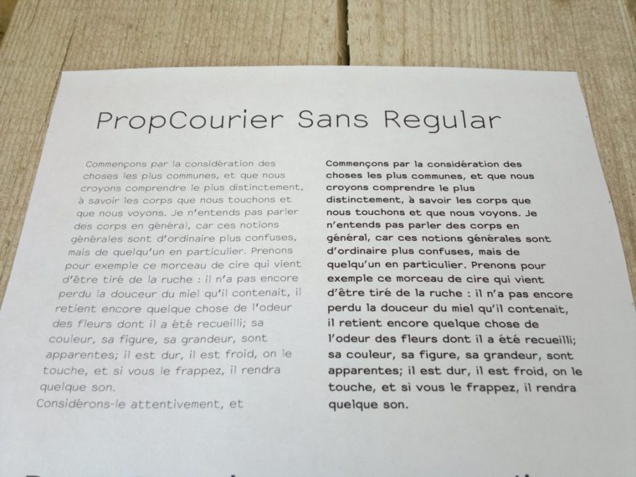
Working today on an improved version of PropCourier Sans, a libre font designed by Manufactura Independente, based on NotCourierSans by OSP, based on Nimbus Mono L by URW++…
Our modifications occured this morning in the frame of the type design workshop given by Dave Crossland.
The changes we did:
- We fixed the placement of diacritics (é, à, ê, ç …), which had some weird offset.
- We produced a medium weight, because the regular weight is very thin (we did some reseach here)


The next thing we are going to do: add a typographic apostrophe, to make it look a bit more litterary…