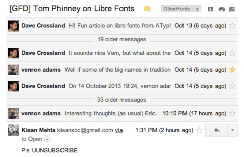
Following the recent ATypI conference, and triggered by Tom Phinney’s provocative article Free Fonts, Revealed and Reviled, a lively debate is happening right now on the OpenFontLibrary mailing-list. Some contributions – by Vernon Adams, Raphaël Bastide, Pablo Impallari, Eric Schrijver – are an enlightening read for anyone interested in the problematics of libre typeface design and distribution.
Some highlights:
From Vernon Adams:
Well if some of the big names in traditional media and publishing got together and bought the internet, so that everything that was published, had to first be comissioned (by experts) and go through some kind of ‘gate’ (manned by experts), and masterfully typeset (by experts), using only 6 or 7 technically superior fonts (hand picked by experts) then that $15 an hour market would disappear overnight. Another problem solved.
From Pablo Impallari:
When people complain about the quality, I think of a few examples:
When Wikipedia started, people also complained about quality. A few years later, quality improved and was not an issue any more.
When Metal Typefaces replaced the scribes, people complained. Quality was not good compared scribes. However, Metal Typefaces replaced the scribes because they where more “convenient” in a “practical” way.
It was the same process when the first digital generation of commercial fonts where made. Quality was not good compared to Metal Typefaces, people complained (some still complain). However digital fonts replaced metal and phototype fonts because they where more “convenient” in a “practical” way.
Mankind always tries to make things easier, to remove obstacles, and to get the job done faster. Libre fonts are more “convenient” in a “practical” way.
People have other things to do in their daily lives. So many things to do… so little time. And Libre Fonts get the job done, faster, easier. (source)
From Eric Schrijver (OSP):
Type design is a funny business. The ATypI style type design thinking, is to conceive of the type designer as an artist, who creates a finished work. Except, they have the misfortune, that compared to other artistic fields, this work can only exist if it is re-used. And it will be re-used by people who are deemed to be incompetent—the artist is misunderstood!
It is kind of like going to a conference of stock photographers. They all claim magazine editors know nothing about photography. They keep cropping!
From Vernon Adams, again:
I think i see evidence that the creative and design communities are generally moving more away from finding meaning in the ‘quality as paramount’ strategy, and more towards finding paramount meaning in any stuff that really keeps them the right side of the creative curve. And it’s not due to a lowering of standards or non-education, it’s the opposite; people are maybe becoming more sophisticated, fine-tuned, and discriminating in their tastes as they become exposed to more and more alternative narratives of what is ‘good’ and what is ‘bad’.
Follow the original thread: http://lists.freedesktop.org/archives/openfontlibrary/2013-October/thread.html
Related reading:
- Ricardo Lafuente: Appropriation and Type – Before and Today (January 2007)
- Eric Schrijver: No-one Starts From Scratch: Type Design and the Logic of the Fork (October 2013)
